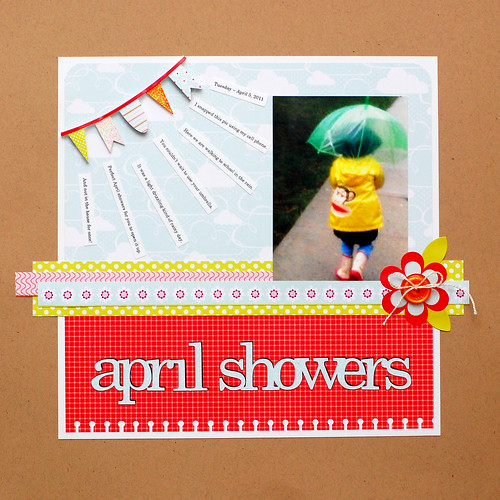
But, I still have to post this rainy layout I created for the Pebbles blog. I am in the phase of simplifying everything I do -- and that includes scrapbooking. While I love the look achieved by many artists when they masterfully throw a ton of products on their pages and it's just instant wow. I admit, I can't do it. Instead of trying so hard to emulate, I figured I'll just do what I'm most comfortable with.
This.

(All products are from the Pebbles Happy Go Lucky line -- love this line!)
To elaborate my post from yesterday, I discriminate when it comes to clear stamps. They are not all created equally. If they do not describe anywhere in their product descriptions and/or packaging that the stamps are made from photopolymer, then it's probably the cheap cling stamps. What is the difference?
INK
- Photopolymer stamps take any ink.
- Cheap stamps only work with certain inks (Versafine, Chalks, pigment, and heavier inks). Regular dye inks will just frustrate you to no end. Forget getting a clean, crisp impression. Upon pressing the stamp to the ink pad, the ink will bead and ball on your image. When you stamp on paper, the stamped image will appear blotchy. If you do not intend to use dye inks, then you're fine. But I personally do not like to be limited in my ink choice. I have not tried sanding my stamps, so maybe upon conditioning these stamps will work with dye inks. I will experiment later.
CLINGABILITY
- Photopolymer stamps are easy to handle. They peel off the clear acetate sheet easily. If a stamp becomes dirty or loses it's cling, a simple wash under water and air drying will restore it's cling.
- Cheap stamps are difficult to peel off their acetate sheet. I find that after awhile they lose their stickiness altogether. And washing won't help.
HOW TO TELL
- Photopolymer stamps have a distinct smell. I can't describe it, so I guess this point is moot. They feel soft and pliable.
- Cheap stamps feel a little more rigid.
Once you get the two different types of clear side by side and compare, it's quite easy to tell them apart - both by their slight but obvious physical differences and their performance quality.
Here's a list of companies that uses photopolymer stamps:
Paper Smooches, Hero Arts, Papertrey Ink, Lawn Fawn, Technique Tuesday, Maya Road, October Afternoon, Market Street Stamps, Stampendous, My Cute Stamps, Memory Box, Close to My Heart, A Muse, Gel-a-tins, The Petal Press, Mint Motif, My Sentiments Exactly, The Cat's Pajamas, Daisy Bucket, There She Goes, Clear & Simple, Waltzingmouse.
That's just a sampling, I'm sure I'm forgetting a lot. I also have a mental list of non-photopolymer companies. I'll leave that for another day!

i absolutely love your layout! it's so cheery, even though it's about rain! :) i have a hard time making those 'product-full' layouts too! though i badly want to be able to! ha ha!
ReplyDeleteStunning layout!! Love the gorgeous colors! Fabulous post about the photopolymer stamps. I think I can tell the difference and oh...I really would perfer these ones that stick! Very informative!!
ReplyDeleteclean and compelling! it's super cute!
ReplyDeleteLove your CAS layout ;) Such a cute photo, and the punched border along the bottom adds the perfect touch.
ReplyDeleteThanks for the guide to photopolymer stamps too. I have some that don't stamp too well, from a well-known manufacturer - not on your list. And they stick really badly to the acetate film too. Couldn't peel off so easily and now they won't go back either. In fact, there are several in the set that I cannot even use because they are permanently stuck to it and won't come off! Frustrating because they are cute images. Ah well, I will always watch for this now! Hugs, Ruth S
beautiful layout! love that cute little banner and how you did the journaling. too cute! yeah... i don't buy (voluntarily) non-photopolymer stamps anymore either. the difference in stamping quality is just not worth the cheap price. if i have to use one, i just stamp them with VersaMark first then use dye ink. it helps. thanks for answering my question, too! =) have a lovely evening/day!
ReplyDeleteI love your page. I think it's clean but not really simple. There are so many elements to it that you can see you worked on and that add so much. I hate that so often clean and simple are put together when sometimes it's just not simple! Yours isn't with the rays and the layers and the button! :> And I hear you on good quality stamps, it took me a bit to figure it out and as a newby it was soooo very frustrating. The bleeding of ink, when the stamps would just fall off the block! A very easy way to tell if it's good is look to see where it's made. If it's made in the US or Canada (some good CDN companies too) it's good, if it's made in China or another it's almost for sure isn't! :>
ReplyDeleteI love your layout. I am right there with you, I can not figure out how to add all that stuff not to mention the bulk!!! Thanks for an honest lesson in clear stamps.
ReplyDeleteoh my goodness, how ADORABLE is this!!!
ReplyDeleteThis is such a gorgeous layout! I love those colours and that awesome little banner! Too cute! :)
ReplyDeleteSWEET layout...thanks for the clear stamp info:)
ReplyDeleteLove, love, love the layout! Your style is incredible!
ReplyDeleteThanks for the stamp info. I have a secret obsession with Studio G. cheapo stamps from Michael's and the ink issue is a pain. I keep buying chalk inks to accomodate them. Appreciate the tips.
(My daughter would so love that Paul Frank raincoat!!)
Such a sweet layout. I love it!
ReplyDeleteGorgeous work girl!!! LOVE! :)
ReplyDelete